
A leader in our sector since 1998
About usExperience · Web design
Web design agency that decides what people understand first.
A company has services, case studies, arguments, processes and prices. Nobody landing on its website needs all of that at once: they need to know what the company does, whether it fits them, whether they can trust it and how to move forward. We design that order first, and then the website that holds it.
All of this wants to be on the homepage
- Services
- Case studies
- Pricing
- Process
- About us
- Sectors
- Team
- Certifications
- Blog
- FAQs
- Contact
- History
- Why us
- Clients
- Awards
- Careers
And this is what decides
What exactly do you do?
Services
Is this a fit for me?
SectorsCase studies
Can I trust them?
ProcessPricingFAQs
So what do I do now?
Contact
Still on the site
- About us
- Team
- Certifications
- Blog
- History
- Why us
- Clients
- Awards
- Careers
Nothing disappears: it just stops competing with what decides.
- Corporate websites
- Redesigns
- Landing pages
- Ecommerce
The starting point
The problem is rarely that the site looks bad.
Most of the websites we redesign looked perfectly good. Something else was failing: landing on one and not knowing within two seconds what the company does, which of its eight services is mine, or what I am supposed to do next.
Six messages, six actions, six times the same weight. Each block, on its own, is well made. What is missing is not quality: it is a decision about which of the six has to be understood first.
Everything at the same level
The company wants everything on show, so nothing stands out. A page with twenty messages does not communicate twenty times better: it communicates once, worse.
Organised by org chart
The structure mirrors how the company is organised inside —divisions, departments, history— and not what somebody arriving from outside needs to understand. They are two different orders and they almost never match.
Good-looking, but silent
Good typography, good photography, good animation and not one sentence explaining what the company does, who it works for and what makes it different. The aesthetics are not surplus: they are on their own.
Mobile treated as a small desktop
On a phone there is no overview: there is a single order, one thing after another. If that order is not decided, the layout decides it by accident — and that is where the long half of the traffic lands.
Grown by patches
Every campaign, every new service and every rush left one more block behind. The site stopped being a structure and became a record of loose decisions.
None of this is fixed by bringing in more traffic. If the problem is that nobody arrives at all, that is work for SEO or Google Ads. This page is about the other problem: people arrive, and nothing happens.
How a page changes
The same content, four decisions.
A company hands us what it wants to say. From there, designing is not a matter of piling things on top: it is a matter of making decisions about that same material. The finished site does not say more — it stops saying everything at once.
What we are handed
We do industrial maintenance for production plants.
Preventive maintenance
Corrective repairs
Line upgrades
18 yearsworking on the plant floor
40 plantsserviced every year
Response within 24 h across Catalonia
Book a site visit
01
Priority
One thing leads. We decide what gets read first and what can wait: of the eight sentences, only one has to be understood before scrolling.
02
Grouping
What is understood together is seen together. Three services stop being three loose paragraphs and start reading as one offer with three shapes.
03
Context
The proof sits next to the claim that needs it. The years and the plants do not belong under ‘about us’: they belong beside the sentence you have to believe.
04
Action
The next step appears where the decision has already been made, and it says what will happen. It is not a button higher up: it is a button later on.
Not a word has been added and not a word has been taken away. All that changed is the order, the weight and the distance between the pieces — and with that, what the visitor understands changes too.
What we design
Four kinds of project and what goes into each.
The same way of working at a different scale. What changes from one project to the next is how much structure has to be decided and how much technology it asks for underneath.
Corporate website
the site that carries a sale decided before the call- Web strategy and information architecture
- Service structure and service pages
- Message hierarchy and value proposition
- User interface (UI) design and a visual system of its own
- User experience (UX) and reading paths
- Responsive web design: mobile, tablet and desktop
- Forms and contact journeys
- Page speed and performance
- Technical foundations ready for SEO
Redesign
when there is already a site and the hard part is deciding what stays- Audit of structure, content and user experience
- What stays, what gets rethought and what goes
- Content migration without losing rankings
- Redirects and continuity for the URLs that already work
- Bringing the visual identity up to date online
- Conversion rate optimisation (CRO) on what already gets traffic
Landing pages
one proposition, one journey and a single objective- Landing pages for Google Ads and Meta Ads campaigns
- Pages by service, by sector or by territory
- A single message and no distractions
- Short forms and calls to action that make sense
- Conversion tracking and reading what happens after the click
Ecommerce and projects with logic of their own
when the site stops being informative and starts doing things- Online shop design: catalogue, product page and checkout
- Private areas and client logins
- Integrations with the tools the company already uses
- WordPress where autonomy matters; custom development where control matters
- Panels and features specific to the business
When a project needs more than a website —selling online, a private area, business logic of its own— the work extends into Ecommerce, Custom web development and Custom software. The experience is still designed here; what changes is what has to be built underneath to hold it.
Already clear on what you need?
Let’s talk about your siteThe proof
Two projects with a lot to sort out.
No mockups and no showcase screens: real captures from both products, where you can see what was put in front of each person and what was deliberately kept out of the way.
Konevent
Room booking product · Product and interface design
One operation, three different experiences.
+200companies using the product
August 2026. The same availability, on all three screens.
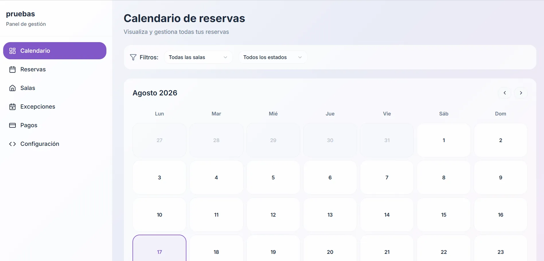
The person running the venue
Needs the whole month, every room and every status at once, with filters to narrow it down. Their screen is dense on purpose: they are not deciding whether to book, they are working.
- Sees
- The full month, every room, every status, payments and exceptions
- Doesn’t see
- Nothing. It is the only screen that sees everything
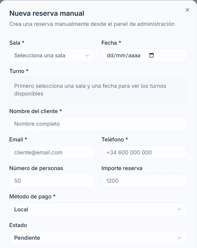
The person on the phone
Creates the booking by hand while talking to the customer. The time-slot field does not fail and does not sit there empty too early: it says what is missing —‘pick a room and a date first’— and waits. A well-resolved state saves a phone call.
- Sees
- One form, in the order the details get asked for on the phone
- Doesn’t see
- The calendar, the other bookings and the slots it cannot know yet
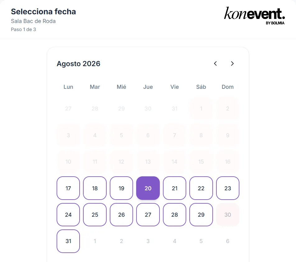
The person booking
Sees the same August, but only what they can choose: the available days marked, the past ones dimmed and their own room. Step 1 of 3.
- Sees
- Which days they can pick and how many steps are left
- Doesn’t see
- Filters, other people’s rooms, internal statuses, amounts and payment methods
It is the same data and the same calendar. What changes across the three screens is what gets shown and what gets left out, and that is a design decision before it is a technical one.
Obrescat
Refurbishment company in Barcelona · Website, acquisition and management panel
A homepage that answers before you ask.
2–3organic leads a day, against roughly one a week at the starting point.
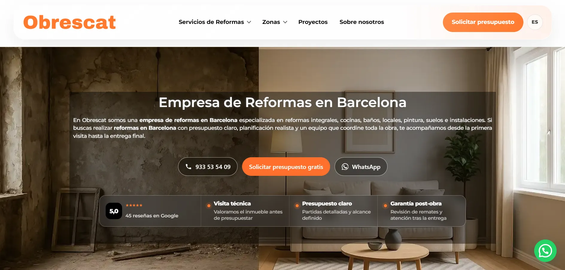
The website, the search work and the management panel were built together, and the result belongs to all three. What design adds is that the structure ordering the homepage is the same one that orders the jobs inside it afterwards.
What they do
The opening image is split down the middle: the building work on the left, the finished room on the right. You understand the business without having read a word, and the headline only has to confirm it.
How to go on
Three ways forward instead of one: phone for whoever is in a hurry, a quote for whoever is comparing and WhatsApp for whoever would rather not call. Every visitor arrives in a different frame of mind and the homepage does not choose for them.
Whether they can trust them
And right below, in a single band, what a refurbishment customer needs to know before calling: the real Google rating, that there is a site survey first, that the quote comes itemised and that there is a guarantee after handover. It is not filed under ‘about us’: it is where the decision happens.
Real captures from both projects. The Konevent panel is shown on a test account.
Let’s talk
Show us your website and tell us what it should be achieving.
We look at it properly before the first call: what comes across in the first few seconds, what competes with what and where people lose the thread. With that in front of us we can talk about scope and budget.
How we work
We start with everything open.
A web project does not start with a list of deliverables: it starts with nineteen unanswered questions. The method closes them in the order that throws away the least work, until the experience is decided. And once the site is live, a few of them open again: now there are people using it.
Unanswered19
- Business objective
- Who we are talking to
- What to explain
- Scope
- What leads on each page
- What goes together
- What leaves the homepage
- Journeys
- Page map
- Typography and colour
- Grid
- States and interactions
- Forms
- Behaviour on mobile
- Technology
- Performance
- What we measure
- What to improve now
- Which page is missing
Closed at this stage
Understand
What does this website have to achieve?
What the company sells, who to, what argument wins the work and what is holding it back today. Out of this comes the objective of the site and the full list of what has to be explained, still in no particular order.
Unanswered15
- What leads on each page
- What goes together
- What leaves the homepage
- Journeys
- Page map
- Typography and colour
- Grid
- States and interactions
- Forms
- Behaviour on mobile
- Technology
- Performance
- What we measure
- What to improve now
- Which page is missing
Decide
What gets understood first?
We order that list around what the visitor needs, not around the org chart: what leads on each page, what goes together, what drops a level and what leaves the homepage. It is the stage that changes the result the most and the one that shows the least on a quote.
Unanswered10
- Typography and colour
- Grid
- States and interactions
- Forms
- Behaviour on mobile
- Technology
- Performance
- What we measure
- What to improve now
- Which page is missing
Build
How does it look and how is it walked through?
What has been decided turns into structure, content and interface: typography, rhythm, states, forms and real behaviour on mobile, tablet and desktop. Plus the technology it calls for: WordPress where autonomy matters, custom development where control matters.
Unanswered6
- What we measure
- What to improve now
- Which page is missing
- What leads on each page
- What leaves the homepage
- Journeys
3reopen once there is real behaviour
Learn
What changes now that real people use it?
Once the site is live, what could not be known before shows up: what gets read, where people drop off, which page is missing. Three questions that were already closed come back into the field, and this time they are answered with real behaviour instead of judgement.
The first three stages happen once. The fourth never ends, and that is why the field never empties completely: a website that has not reopened a single question in two years is a website that has stopped keeping up with the business.
Fit
When a redesign makes sense.
- The website no longer reflects the level the company works at today.
- There are plenty of services and none of them quite lands.
- Traffic arrives —from SEO, from campaigns, from the sales team— and nothing happens with it.
- The site has grown by patches and nobody knows what each page is for any more.
We mostly work with
- Service businesses
- B2B
- Industry and technical projects
- Companies with several business lines
- Ecommerce
- Digital products
If what you want is the cheapest website possible, or somebody to build a design that is already closed without questioning a single decision, there are better options than us: our work starts exactly at those decisions.
Frequently asked questions
Before you commission a website.
How much does a professional website cost?
There is no single price because there is no single project. What moves it is measurable: how many pages and how many services have to be structured, whether the content exists or has to be worked on, whether it is built on WordPress or calls for custom development, and whether there is a shop, a private area or integrations. We would rather look at the starting point and give a fixed quote with the scope in writing before starting, instead of a range that means nothing.
How long does a web design and development project take?
It depends on the scope, but what stretches a project is almost never the design: it is the content that is missing and the internal sign-offs. That is why the first stage closes the objective and the scope in writing and the second closes the structure before anything is drawn. Once those two decisions are made, the rest moves at a predictable pace.
Can you redesign the site we already have without losing rankings?
Yes, and it is half of what we do. Before touching anything we look at which pages get traffic today and for which searches, so we know what has to be kept: those URLs, their useful content and their heading structure. Anything that changes address gets redirected. A redesign loses rankings when the site is rebuilt as if the previous one had never existed, not because it was redesigned.
Do you work with WordPress or with custom development?
With both, and the choice belongs to the project, not to us. WordPress makes sense when the team wants to publish and extend on its own without depending on anybody. Custom development makes sense when control matters: performance, features of your own, integrations or a structure no off-the-shelf CMS holds well. We decide it in the third stage, once we know what the site has to do.
Who writes the content?
The knowledge of the business comes from the company: what it sells, how it works, what sets it apart and which figures it can show. What we bring is the order and the shape —what goes on each page, in what sequence, at what length— and the rewriting of what you hand over so it fits that structure. If content production beyond that is needed, we say so up front and it goes into the scope.
Does design include development, or are they two separate things?
On a normal project they go together: we design and build the site, which is why what gets proposed in structure and interface is always buildable. They are two different capabilities, though. Experience design decides what the visitor understands and lives through; custom development comes in when the project needs logic of its own —processes, panels, integrations, a product—. When that point arrives we say so, because it changes the scope and the budget.
Can you guarantee the site will sell more?
No, and it is worth being wary of anyone who does: sales depend on the offer, the price, the market and the sales team, and a website does not rule over any of that. What can be sustained is that the site stops getting in the way: that people understand what you do, that visitors find their part, that there is a clear next step and that what happens can be measured. If with all that resolved the problem is still somewhere else, we will say so.
If you have read this far, the next step is to tell us about it.
Let’s talk about your site